Google Maps shows you where things are. TripAdvisor is built around reviews. The government’s tourism portals are static catalogues. None of them start from the question a transit rider actually has: I just got off at this station. What’s worth walking to from here?
Jakarta Transit Heritage Explorer starts from that question instead of from a destination search. Get off the KRL at Jakarta Kota, or the MRT at Blok M (the same stations mapped in Jabodetabek-Connect’s transit diagram, and built up over the 35-year timeline in CDMP-Jabodetabek), and the app hands you nearby heritage buildings, museums, and cafés, the walking route between them, short historical context for each stop, and a lightweight passport to stamp as you go, with no account and no app install beyond adding it to your home screen.
Three nodes, three different problems
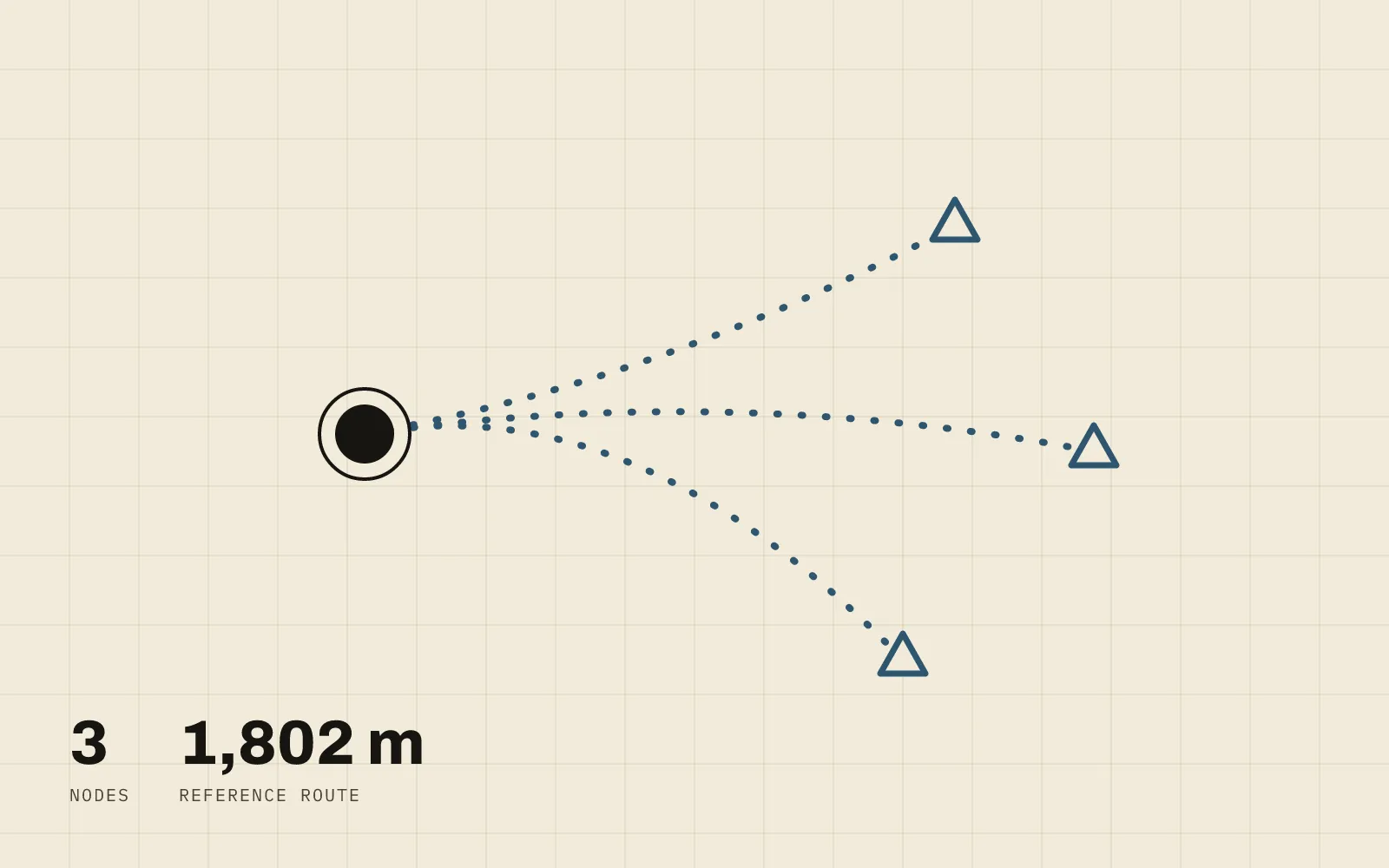
Rather than trying to cover the whole city at once, v1 picks three areas that each stress-test a different part of the idea, and deliberately doesn’t build them to the same depth:
- Jakarta Kota: the reference implementation, full depth. A dense, well-documented heritage cluster served by a single mode (KRL), matching the original scenario: Bank Indonesia Museum → Bank Mandiri Museum → Fatahillah Museum → Café Batavia → Toko Merah → Kota Intan Bridge.
- Blok M: a multimodal integration test. TransJakarta’s Corridor 1 (running since 2004) and the MRT’s Blok M BCA station sit physically close together, but the KRL only reaches the area via Kebayoran station, about 3.3 km away, not a direct walk. That gap between a “mature” transit connection and one that needs an extra ojek leg became a real test case for modeling mixed data quality across transport modes.
- Ragunan: a macro-to-micro venue map test. One large single venue rather than a cluster of separate buildings, served by TransJakarta Corridor 6, testing in-venue navigation rather than the core between-destination exploration loop.
An architecture sized for three nodes, not a platform
The long-term vision here is bigger (FastAPI, PostGIS, real-time GIS analysis), but for three nodes, precomputing everything offline made a live backend pure overhead. v1 runs on what the project’s own decision record calls the “light” architecture: a Python ETL pipeline processes GTFS/OSM/ manually-curated source data offline into static GeoJSON files, which a Next.js + MapLibre GL frontend reads directly, with no server, no database, and no auth. Filtering and rule-based recommendations run entirely client-side.
The digital passport (a light gamification layer: a stamp per destination
visited) lives in localStorage, but sits behind a PassportRepository
interface with fully async methods, so migrating it to a real backend
later doesn’t mean rewriting every caller, just swapping the implementation
behind that interface. Two check-in types feed it: a virtual stamp anyone
can trigger from a destination page, and a GPS stamp that upgrades it to a
premium variant once you’re actually within 75 meters (with accuracy ≤ 100m
via the Geolocation API) of the real place. The upgrade only goes one way.
Walking distance isn’t circle math
One of the more concrete findings came out of testing the Jakarta Kota reference route: OSRM’s real walking path from Bank Indonesia Museum through five more stops to Kota Intan Bridge came out to 1,802 m over 24 minutes, but individual legs showed detour ratios of 1.06× to 2.85× against straight-line distance. The worst case, Museum BI to Museum Mandiri, is 113 m as the crow flies and 323 m by the actual street network. A simple buffer radius around each station would have been actively misleading in a district as dense as Kota Tua. So “reachable within X minutes” filtering uses real network walking distance from OSRM, precomputed once per node. Buffer circles are used only as a last-resort visual fallback, never for filtering. The same preference for a measured relationship over a naive geometric one drives the kernel-density approach in the Cikarang settlement-pattern study: straight-line proximity isn’t the same as the thing you’re actually trying to measure.
Shipping bugs are still bugs
Not everything was clean. A black-map bug shipped as far back as Phase 1 and
stayed hidden through multiple rounds of verification, because those checks
only confirmed map.loaded() and that queryRenderedFeatures returned
results, both of which can be true even when the map container itself has
collapsed to zero height. The actual cause: the container used absolute inset-0, but MapLibre’s own stylesheet sets .maplibregl-map { position: relative }, which silently overrode it. The fix was a one-line change to
h-full w-full, but it changed how the project verifies maps going
forward, now checking the container’s real getBoundingClientRect()
height and sampling actual canvas pixels, not just querying the map’s
internal state.
Status
All three nodes are built and working end to end: GIS map, destination detail, precomputed walking routes, filters, the passport/check-in system, PWA support, and a persisted language toggle. A GitHub Pages deploy is wired up in CI but not live yet. It’s one repo-settings change away, not a code problem. What’s still open: a field test of the GPS check-in threshold on a physical phone over HTTPS (only simulated so far), and replacing the isochrone display layer’s routing-engine dependency, which has been intermittently unreliable on the free public instances tried so far.