Jakarta’s official Peta Integrasi Transportasi Umum (the transit integration map covering MRT, LRT, KRL Commuter Line, the airport rail link, Whoosh high-speed rail, and TransJakarta BRT) exists only as a single, dense PDF. Around 280 stations packed onto one static page, several of them still under construction. It’s accurate, but it doesn’t give you any feel for the network as a living, connected system, and there’s no way to explore it: no zoom, no filtering, nothing to interact with.
Jabodetabek-Connect redraws that map as an octilinear diagram in the visual language of Mini Metro (thick rounded lines, geometric stations, a pastel palette), inspired by the game’s style without using any of its assets, fonts, or branding. Pan and zoom smoothly across the whole network, and watch small trains move along each line in something close to real transit rhythm.
This is the network as it operates today, not how it grew. CDMP-Jabodetabek covers the 35-year construction history behind these same lines, and Jakarta Transit Heritage Explorer picks up from here, turning three of these stations into walking routes to nearby heritage sites.
What’s built
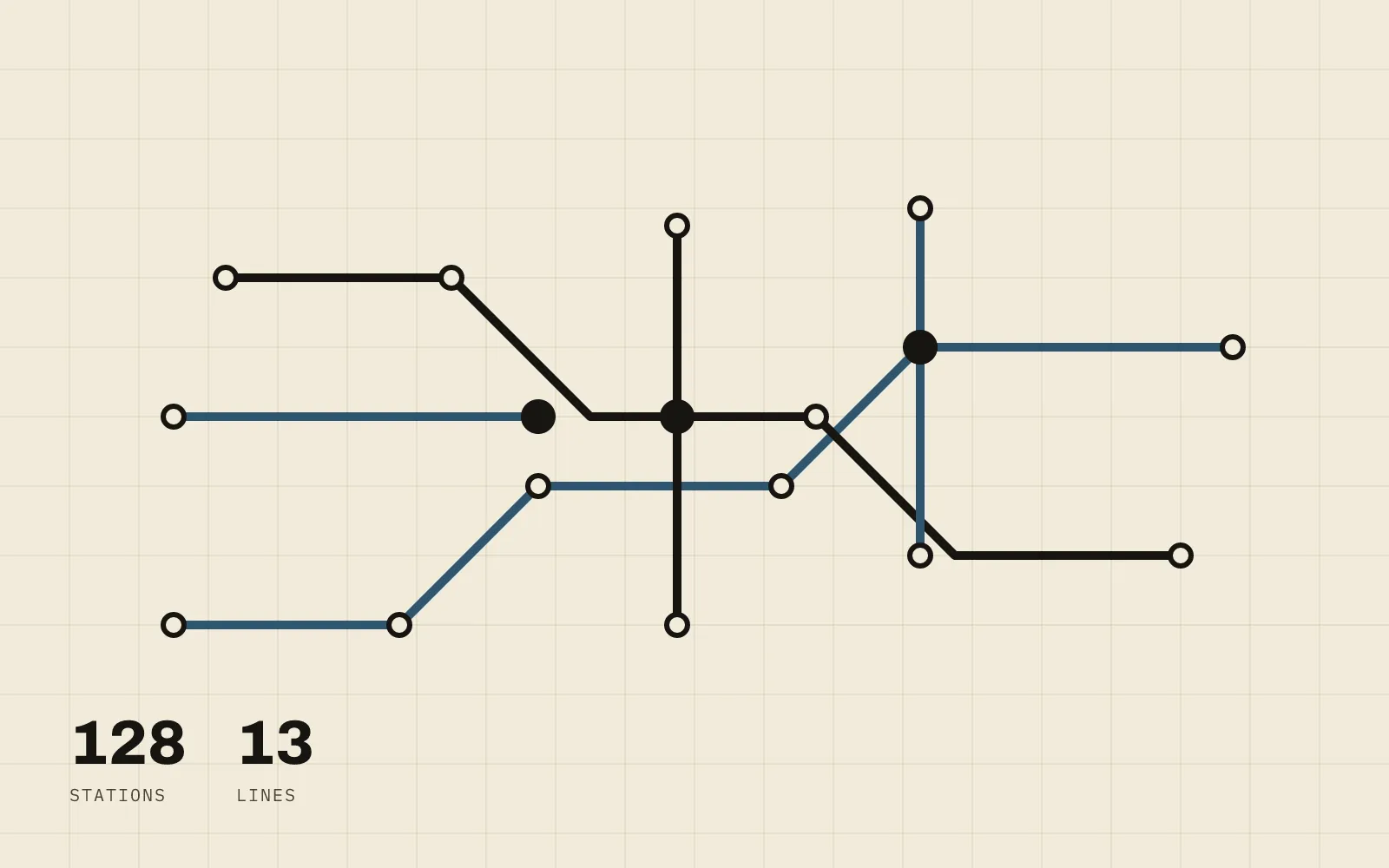
The current build covers every rail and BRT line actually in operation today: MRT, LRT Jakarta, LRT Jabodebek, all five KRL Commuter Line branches, the Soekarno–Hatta airport rail link, Whoosh, TransJakarta Corridor 1, and the airport Kalayang, for 128 stations across 13 lines curated line by line from the source PDF. Lines still under construction are deliberately left out; this is a map of what you can actually ride today, not a roadmap.
On top of the static diagram:
- Pan and zoom (mouse, trackpad, and pinch on mobile) stay smooth across the whole network, with station labels appearing progressively as you zoom in so the map never looks cluttered at any level.
- Interchange stations (anywhere two or more lines meet) render as capsule markers instead of plain circles, so transfer points read clearly at a glance.
- Animated trains run along every line, each following a timetable built from smoothstep easing and realistic dwell time at stops, turning around at open-ended termini and looping on closed lines.
- Per-line toggles, grouped by operator, let you fade lines in and out to isolate a single service. An interchange stays visible as long as at least one of its lines is still active.
- Light/dark theme, manually switchable and persisted, with a pre-hydration script so there’s no flash of the wrong theme on load.
From a static PDF to a typed dataset
There’s no live GTFS feed or transit API behind this: the official PDF is
the only source of truth. An offline Python pipeline (pymupdf) extracts
station badges and coordinates from the PDF’s vector text, seeds them onto
an abstract grid, and a curation pass (schematize.py) filters that down to
the whitelist of currently-operating lines, resolves interchange hubs, and
straightens routes into consistent octilinear (0°/45°/90°) doglegs. The
output isn’t runtime JSON: it’s typed TypeScript written directly into
src/data/, so a typo in a station id is a compile error instead of a
silent bug. A validation script (check:data) checks octilinearity and
cross-references on every run.
Rendering: SVG, not canvas or WebGL
The map is plain SVG inside React, drawn in an abstract grid viewBox so
strokes stay crisp at every zoom level. That matters for a style this
dependent on clean, thick lines. Pan and zoom are handled by d3-zoom and
d3-selection, the one runtime dependency beyond Next.js and React: d3
writes the transform straight to a <g> ref, and React only re-renders when
the discrete zoom “band” changes (which controls label density), not on
every wheel or drag event.
Train animation follows the same zero-re-render discipline. Each route’s
drawn geometry (the same rounded, octilinear paths used for rendering) is
flattened into a polyline of short segments with cumulative arc-length
offsets. A pure timetable module turns elapsed time into a position and
heading along that polyline with no dependency on React or the DOM. A single
requestAnimationFrame loop then writes transform attributes directly
onto the train elements every frame. For a fleet of roughly two dozen
trains, that’s the difference between smooth 60fps and React fighting the
render loop on every tick. Positions are a deterministic function of time,
so trains can’t drift out of sync and pick up exactly where they should
after a suspended browser tab wakes back up. The whole thing respects
prefers-reduced-motion: trains simply stay parked at their stops.
Status
The full v1 feature set is built and passing its data validation, type checks, and build: the static network, pan/zoom, interchange markers, zoom-banded labels, train animation, line toggles, and the theme switcher. What’s left is polish: a production deploy, a further pass on label collision at the densest zoom level, keyboard-based pan/zoom for full accessibility, and double-checking a handful of stations the source PDF left ambiguous (an infill KRL stop, a station serving a newly opened terminal, and an unmarked branch line).