MRT construction updates live in news articles. Toll road progress lives in government press releases. New-district announcements live in developer marketing pages. Nowhere do they live together, on a map, in a way that lets you actually watch Jabodetabek grow: which line came before which toll road, which new town predates the transit that eventually reached it.
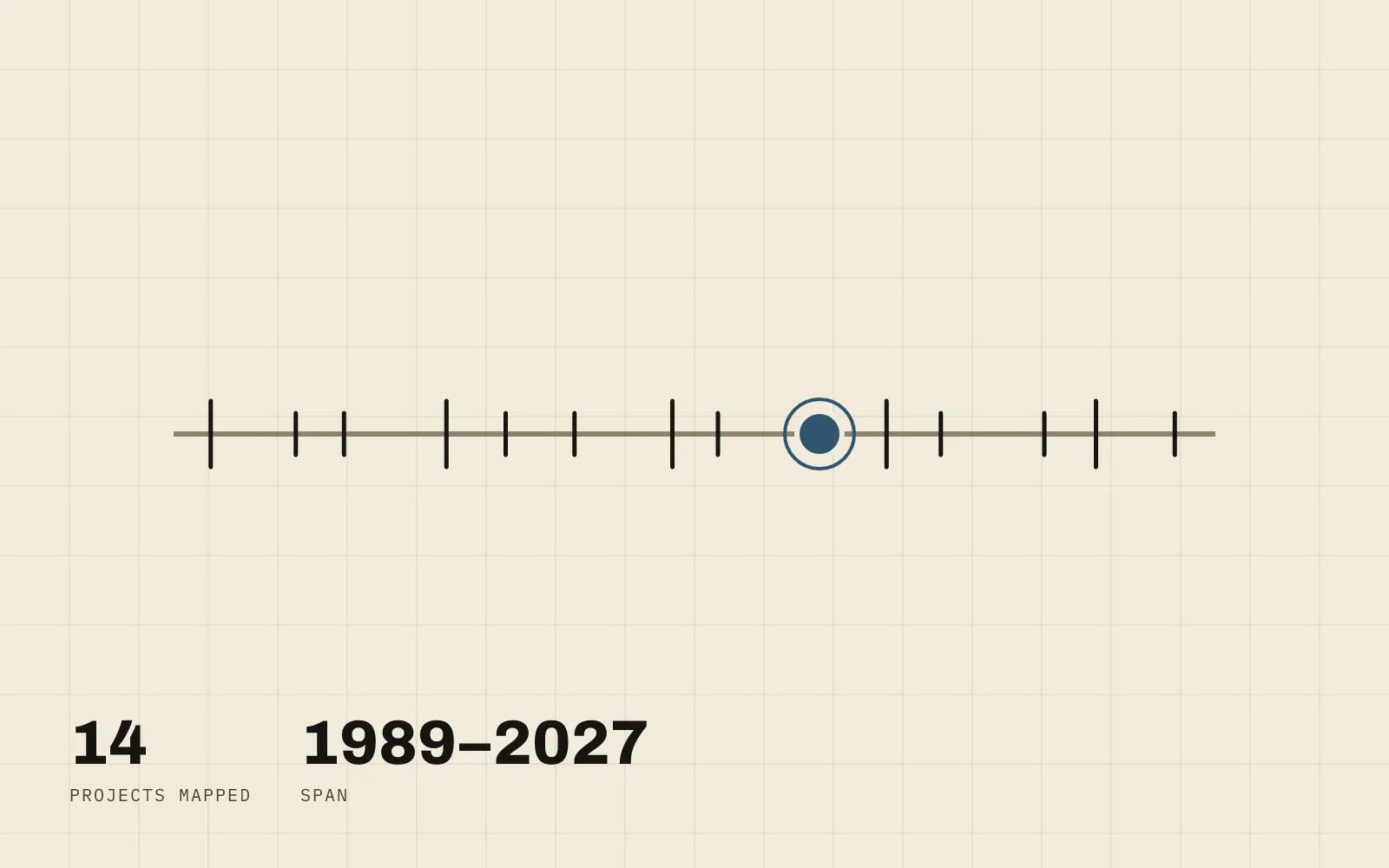
CDMP-Jabodetabek is a dark, single-page map of the region with a timeline slider along the bottom. Drag it across the years and development projects (MRT lines, toll roads, new districts, transit landmarks) fade in and out based on when they were actually built, turning three and a half decades of scattered infrastructure history into something you can scrub through in a few seconds. It’s one of three Jabodetabek-focused maps built here. Jabodetabek-Connect draws the operating transit network as a Mini Metro-style diagram, and Jakarta Transit Heritage Explorer turns transit stops into a walking companion for heritage sites, but this one is the only one about when, not where.
Fourteen projects, four kinds of growth
The dataset spans 1989 to 2027 (BSD City’s founding year through Meikarta and PIK2’s projected completion), curated as static GeoJSON across four categories: rail (MRT Jakarta Phase 1, LRT Jabodebek, LRT Jakarta), toll roads (JORR, the elevated Jakarta–Cikampek II, Cinere–Jagorawi, Depok– Antasari), new districts (BSD City, Meikarta, PIK2, Summarecon Bekasi), and transit/infrastructure landmarks (the Whoosh high-speed rail terminus at Halim, Soekarno–Hatta’s Terminal 3, Jakarta International Stadium). Clicking any project (a line or a marker) opens a detail card with its name, type, year range, and a short description. There’s no backend behind any of it: the whole dataset is one GeoJSON file checked into the repo, the same file-based, no-live-queries approach used throughout this site’s mapping work, including the building-footprint detection behind the Cikarang study.
Borrowing a visual direction, not a screenshot
The starting point was a single Dribbble concept shot (Cuberto’s “City Development Map Based Timeline”), which showed the shape of the idea (a dark map, a timeline as the primary interaction, a confident single accent color) but had no working implementation behind it, let alone one built for Jabodetabek. The build takes the direction (near-black base, one green accent) without trying to reproduce the shot pixel-for-pixel; the actual map, data, and interaction are original.
Faking a transition MapLibre doesn’t have
The one piece of this that took real problem-solving: MapLibre GL doesn’t
transition data-driven paint properties, so simply changing the timeline’s
filter expression makes projects pop in and out abruptly: there’s no way to
just ask it to fade a filter-driven layer. The fix animates a fractional
year instead of the filter itself: dragging the slider drives a
requestAnimationFrame loop that tweens between the old and new year, and
every frame re-evaluates each project’s opacity as a ramp starting 0.75
years before its year_start/year_end, so projects fade in, then
crossfade from dashed-in-progress to solid-complete as the scrub passes
their completion year. The filter itself stays loose (wider than the visible
range) while the tween is in flight, and only tightens once it settles, so
click hit-testing never lags behind what’s rendered. Landing on a whole year
produces the exact same visual state as the old instant-filter behavior. The
animation is purely additive. prefers-reduced-motion skips the tween
entirely and jumps straight to the target year. One thing deliberately
not added: a separate highlight effect for projects that just appeared.
The fade-in from the tween already reads as a highlight, and stacking a
second animated cue on top of it would have broken the “one orchestrated
moment, not scattered effects” rule this project holds itself to.
Status
The map, the curated dataset, the timeline filtering, and the fade/crossfade animation are all built, type-checked, linted, and passing a production build. What’s left is exactly the kind of verification that needs a real browser rather than a headless one: a Vercel deploy, a responsive pass at 375/768/1024px, and watching the slider animation actually play. So far it’s confirmed correct by simulation and code review, not yet watched running on screen.